
The Pantone Matching System (PMS) is a valuable resource for graphic designers, package designers and brand identity professionals. Invented in 1963, the PMS is in heavy use around the world, including among commercial printers. If you’re looking to partner with a commercial printer, then it’s highly recommended to select a print professional that observes the Pantone Matching System, and here’s why:
- The PMS allows designers and brand managers to effectively communicate color information to each other.
- The PMS provides designers with a clear idea of how a particular color will be represented in print.
- The PMS allows designers to preview colors on a few different mediums, which is important for packaging applications.
- The PMS gives designers access to an expanded range of colors, including metallic and phosphorescent colors.
- The PMS ensures consistency across all elements of an organization’s branding.
The Pantone Matching System guarantees that any colors used in your print materials are precisely targeted and consistently applied in your branding.
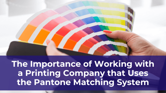
What is the Pantone Matching System?
Pantone Matching Systems are made up of thousands of Pantone “chips,” which are individual color swatches each tied to a specific numeric code. Every Pantone chip is unique, so there are no color repeats in a PMS.
It’s less complex than it sounds, as each PMS is essentially hundreds of small, high-quality paper (or cardstock) panels threaded together on a metal binder ring. It’s common for printers and design studios to have multiple Pantone Matching Systems for their design teams.
The important aspect of the PMS is standardization. Pantone colors are standardized, so a PMS from 10 or 20 years ago will still work with modern Pantone Matching Systems. In effect, this allows designers and others to communicate using a color language that everyone understands.
Four Reasons Why It’s Important to Work with a Printing Company That Uses the Pantone Matching System
If your organization has ever attempted to design and print its branding materials in-house, you may have noticed how difficult it is to achieve the right look consistently. This is why the PMS was developed – to resolve frequent frustrations between designers, printers and the brands that rely on both. If your company needs a commercial printer partner to take its brand to the next level, here’s why you’ll need one that has a Pantone Matching System in place:
- Precise color communication – Before the PMS became widespread, designers and printers had frequent issues with matching colors from one user to the next. It was common for designers to select colors, verify them with the client and send them off to the printer – only to get something back that doesn’t match the original color information. Pantone Matching Systems have resolved this issue by standardizing color information across any platform. Because each color is associated with a unique numeric code, designers and printers only have to share the color code with each other to ensure the exact same colors are used at every step of the production process, including the final print run.
- Clear color production details – Designers and printers can also use the PMS to select colors during the design process. Each Pantone chip provides perfect color accuracy so commercial printers will know exactly how each design will look on paper. A PMS also includes coated and uncoated paper samples of each color, so designers can assess what it will look like on different types of material.
- Expanded color palette – Pantone Matching Systems are developed from an expanded color gamut that includes metallic and phosphorescent colors for additional creative options. If your organization wants to distinguish its branding with less common colors, you’ll want to work with a commercial printer that has a PMS in place.
- Better color and printing consistency – Ultimately, the most important advantage of a PMS is ensuring consistency from print job to print job. If your brand colors aren’t consistent, it will make your organization appear less professional and can adversely affect your branding efforts. A PMS guarantees this needed consistency.
Looking for Better Color Consistency for Your Brand? Look for a Commercial Printer with a Pantone Matching System
There are two characteristics of every effective branding design – smart color scheming and consistency. Your brand designer, which may be your commercial printer, will need to prioritize both to create an effective look and tone for your company or product.
A Pantone Matching System eliminates any of the guesswork between designers and printers, ensuring everyone involved is incorporating the exact same colors into every piece of print material. That improves consistency.
A PMS also gives printers and designers an at-a-glance reference for more than 2,000 colors, so they can quickly identify the best colors for their client and develop better looking color schemes for a variety of applications.
There are several good reasons to partner with a commercial printer that has a PMS in place, and the benefits will boost your organization’s branding power.

